
Over the past year, we have been working behind the scenes to re-invent the Attack Academy: a re-focused brand, an all-new logo, a refreshed website, a deeper roster of pro players, more content and a brand new app, just to name a few. It’s been a rewarding journey, and we want to share it with you.
With all the changes being made (new pros, new app name and design), it was time to look inward to re-define our logo and visual identity moving forward. If we wanted to take Attack Academy to the next level, we needed a consistency to our brand that we had not yet had before.
Before we could design anything visually, we had to agree on what we stood for and how we wanted Attack Academy to make people feel. The brand needed to be cool, but professional. Bold, but not too complex. Just like we do in lacrosse, we turned the greats (in the mobile app field) to study what they were doing right. We gravitated toward Peloton, Whoop and Masterclass as brands in the online fitness world that brought a simple, but captivating visual experience.
It’s no coincidence that the world’s strongest brands also have the most recognizable logos. We’re not artists ourselves, so we brought in international award-winning branding specialist Eric Erickson to help us bring our ideas to life. We wanted to keep our iconic “A,” but knew we could do more.
“The new Attack Academy logo needed to be full of energy,” describes Erickson. “We used aggressive lines that slant forward and a two-tone color effect within the A icon to mimic the energy and movement of a lacrosse player. It was also important that we had a strong icon that could be used on its own or as part of the full logo.”
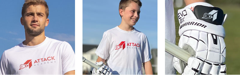
As far as strategy goes, “A logo is rarely seen by itself; it’s always in context of something: on a t-shirt, on a hat, on a jersey or in the app – so we needed to make sure the new logo was versatile enough to function in any setting.”
As you can see, we explored a number of variations before landing on the final product.
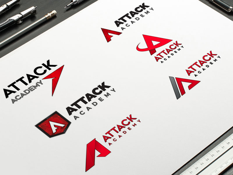
The refreshed logo was chosen for a few reasons:
- The aggressive new “A” icon is a perfect representation of the energy and movement of any athlete at the top of their field. Always looking to be a threat, always looking forward.
- The lacrosse head element has been enlarged to make it clear that we are a proud lacrosse organization. This element also has a dual purpose as it can also be swapped out for the barbell icon, which is the look for our new Strength & Conditioning content.
- The versatility of a strong “A” icon can be used on its own, or in the full lockup look with the words Attack Academy.
- The red colorway was kept from the original brand as red is a color associated with excitement, energy and ambition.
- Last but not least, we wanted a logo that kids would want to wear. It had to look cool. We want every kid who wears our logo on their shirt or hat to feel like they’re truly part of our community. When you look good you feel good, and when you feel good you play good.
With our visual brand now in place, it was time to start putting in the structure of Attack Academy 2.0 and dial in our app experience for players of all ages. Stay tuned for Chapter 4…
Attack Everything,
-The Attack Academy Team